Post by Sonam Kapoor on Sept 8, 2011 12:10:16 GMT -5
Hello Girls!!!
Welcome to your Second Judging Session!!! This week, you have choose a month and translate it into your photo to be used for ANTM Cycle 5 Calendar
Let's start our judging session now!!!
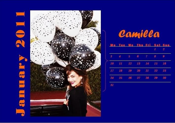
Mandy: I definitely do see where you were going with this, and I think it's a very creative use of the theme! I totally love the facial expression here, it's flirty and adorable! The makeup is great, the earrings are great (and match the balloons, omahgash!)
One thing I'll note, though, is that the balloons definitely seem to dominate the photo, and we hardly get to see anything of your body in this shot, so that's a bit disappointing, but nothing kill-worthy, I'd say...
Sonam: I love this one. One of my favorite photo this week. You look very energetic, fresh and I love the styling in this photo.
Amanda: I'm completely with Mandy here - the photo is great and a creative, somewhat risky use of the theme and although it's definitely retro, it works. The main issue is indeed the balloons which seem to distract the image from you, even though it's a fun, festive shot. We want to see YOU here. This isn't too big a problem, and there's no chance you're getting popped this week if you know what I mean.
Very strong, and very appropriate for a calendar.
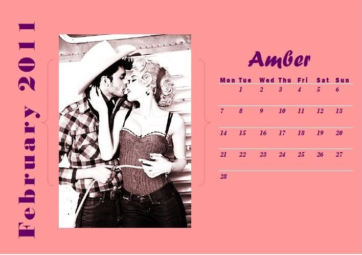
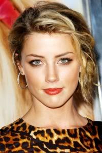
Mandy: Amber, I love a lot of things about this photo. I love the vintage feel to it, and I love the outfit and the overall style that you have going on here. It's a neat and original pose, your hair is great, it's very classy, and it fits your month to a tee.
However, I'm not a fan of the photo quality. It almost seems a bit overexposed, and lot of the finer detail is lost. But other than that, it's a phenomenal shot.
Amanda: I don't completely like how the vintage feel contrasts with the other girls' images and in a way, this sort of feels like it's from a completely different calendar; it's not the kind of shot we expected, but that's more a good thing than a bad one. I am with Mandy in that it's been tampered with a bit too much by something like Photoshop.
But aside from my little gripes here, it IS a great shot and fits the month perfectly. Pretty much everything else works great and I foresee you getting high marks once again.
Sonam: I like this one, Amber. You look very comfortable here and I get the February vibe in this photo.
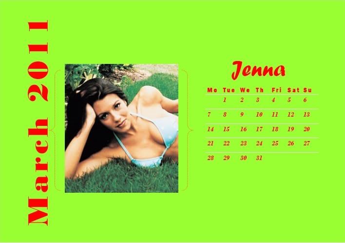
Amanda: I understand that all of the summer months were taken, and although this is a good picture, there are a few fundamental problems:
1. It's a bikini pic. Except to please Ethan, do you wear bikinis in March?
2. The resolution is really really low - it's tiny, and we don't get to see some things in full detail
3. The "green" theme you mention really isn't present or focused, and things seem TOO green for March, when the snow is melting and life starts anew. This seems like life has already restarted.
You should pace yourself more in the future. Look around for a good picture with a good resolution and not just run headfirst into things. I know bikinis are your specialty but... it just doesn't seem to be appropriate for anything other than a swimsuit calendar, where all of the pics are like this. It wouldn't stand out there since it's cropped poorly.
If you do make it to next week, which I hope you do, think things through a bit before just posting something. Perhaps create a thread to compare images side by side using the [/img] tags - that's how I'd do it. Find the one that works, maybe even before choosing your month. Give us a great photo that works for the theme, else you'll end up like Jennifer. We don't want that.
Sonam: Well Amanda just said everything.. Hmm.... I wish we could see this photo more detailed. I think last week you really impressed us but this week not so much.. Sorry Jenna
Mandy: I'd say it depends where you live. In Florida you could probably get away with that all year round.
There's been a lot of stuff said already, but I'm going to come up with my own critique anyway because that's just how I roll. I definitely see where you were going with the greenery here, Jenna, and I like the pose that you have going on. I'm a bit iffy on the facial expression, though, because it almost looks bored, to me. I do wish you'd had a bigger photo, as well.
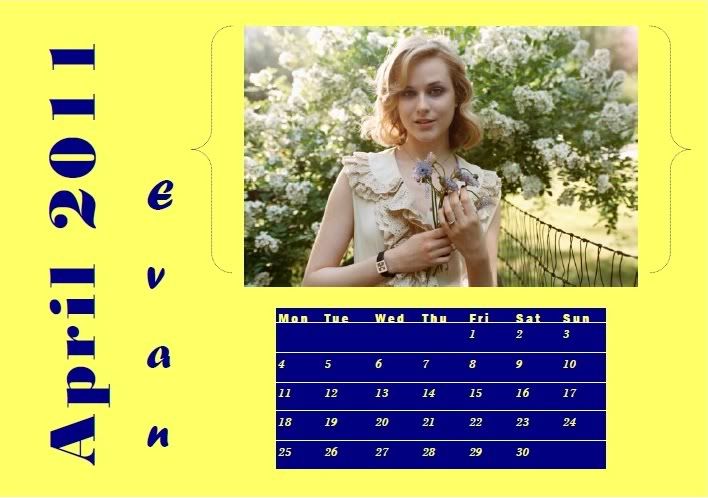
Amanda: This is way, way better than last week. This definitely seems spring-like and definitely feels like a calendar photo. I really like your hair and the flowers you've picked - it's a nice, gentle shot that is appropriate for your chosen month. Not to mention it's definitely a model shot too.
The biggest gripe I have is that fence. It seems to distract from you and seems out of place. Fences are no fun...
But yes, huge improvement. Amanda likey.
Sonam: I agree this is way better than last week. We got to see your face and your features. Your skin is flawless and I think you have a great week. My only problem is your mouth. Still stiff.. Relax it
Mandy: I like the pose and the facial expression you have here, and you did an excellent job on matching the theme! Such a step up from last week, Evan! One thing I will say, though, is that the coloring in this photo seems a little bit drab. When I work with pictures like this, I generally tweak the contrast a little, which you can do in just about any photo editing program. It's a little extra work, but it'll get you better results.
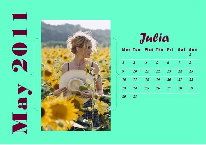
Amanda: Those are sunflowers, and they don't bloom in May. From my experience, they're usually in bloom in July and August and are most commonly associated with summer. This picture doesn't fit with May - it seems too early in the year. My calendar just has random pics of me for random months, but most of them are similar Survivor pics... and you only have one to win us over with.
I also don't like how your bangs are falling over your face - since your head is tilting to the side, we don't get to see much of your expression; a profile shot really doesn't make the most sense here, since this is the image people will look at when checking their schedule. I can hardly make out your eyes and the resolution is low... and I really don't see a focal point here. YOU need to stand out here, and this image makes the flowers sort of engulf you.
I don't mean to be rude... but I don't really like it. There are too many issues with it. Since July was available, you should have picked that and you would have done a heck of a lot better. Sorry.
Sonam: Wow Amanda... I learn a lot of things from your critiques. Kinda remind me of Mrs Danielle, my junior high school science teacher. Well back to your photo. I love the profile shot. I think you should close your mouth. I actually love the simplicity of this photo. The sunlight and the hat for me fit the May. Good luck
Mandy: Eh, I didn't know that about the sunflowers either, and my guess is that neither will the average person at home. While I agree with Amanda that the blooming thing is indeed an issue, I'm going to choose to overlook it. To me, modelling is about what looks good, not about what's true. (Case in point, if it was more about truth than looks, we wouldn't wear makeup.)
I think that this is a step up from last week's photo, and you definitely did try to deliver something that wasn't safe. I think it's an interesting shot, and I find the pose intriguing and creative. Wish we could see more of your outfit, and it's a bit hard to make out your facial expression here, but overall it's quite an improvement.
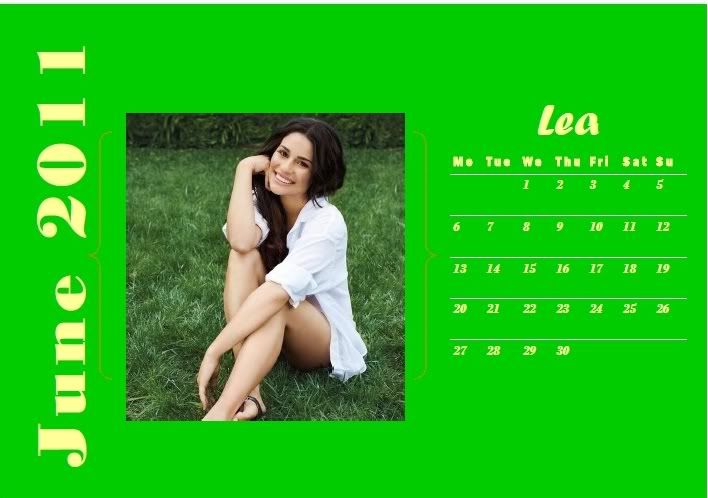
Sonam: You look very sweet and I can feel the June vibe in this photo. But be careful with your smile. Sometimes, you don't have to be too wide with your smile. But overall, you did great, girl
Amanda: Although I can definitely feel the summer here, this photo isn't as memorable as the last one. I do like the smile - mine's really wide too - and it's a pretty, relaxing photograph. It just isn't as memorable as yours last week, but I don't think it's too big a problem. Good job!
Mandy: I think that this picture is very wonderful and sweet, and it fits the theme really well. The facial expression is great, the pose is very classy, and overall it's quite attractive. My one criticism would be that color-wise it seems a tad plain, but that's not really a negative thing, since calendars tend to do that pretty often. Overall, I think you're very strong this week.
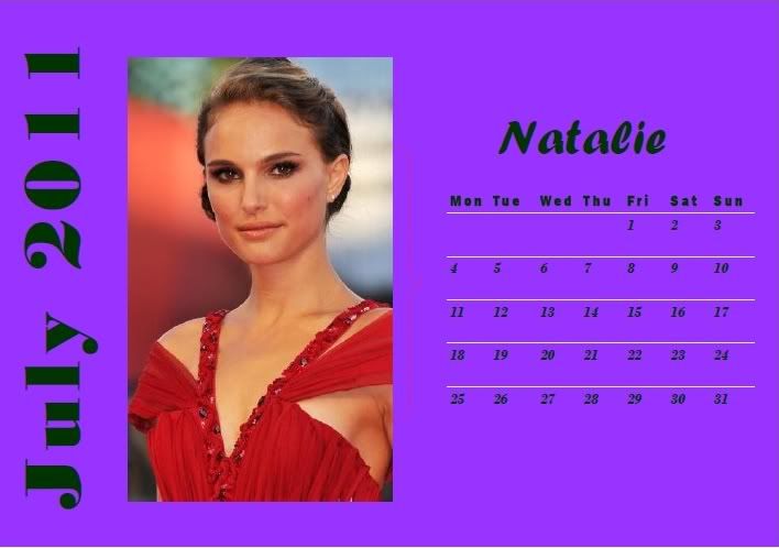
Amanda: This shot is great in a lot of ways. I like how you tie in the birthstone and use a very summery photo - is that a tan you have going? It's a beautiful shot and it definitely fits July well and I can totally see this going well with a calendar. No angel fish either! Great work :-)
Mandy: You definitely were creative on this one, Natalie, and I'll give you some definite props for putting the effort into doing your research. That being said, I'm not really a fan of the facial expression in this photo, there's just something about it that's off-putting. But the gown is great, and the hair and makeup are geat, so it's a great photo from where I'm standing.
Sonam: You look good as usual but I'm not really a fan of this photo. Maybe I'm expecting a modeling shoot. However.. I love your neck here. Very long and delicious
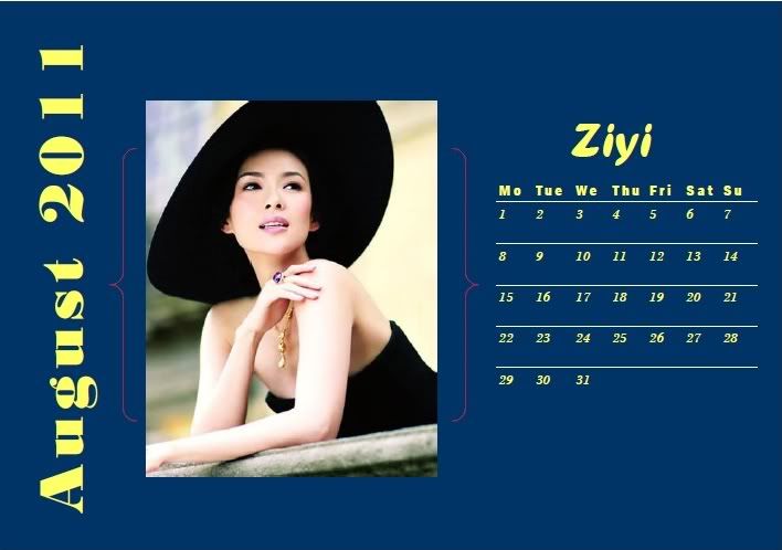
Sonam: Gorgeous. Very fashionable for me. I love the styling. Simple and stunning. Overall, I don't really have much problem with your photo this week, Ziyi
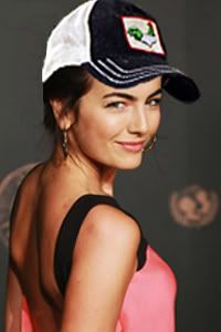
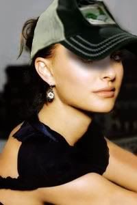
Amanda: I'm not completely feeling that hat - it completely camouflages your hair and it almost looks like you're wearing it to cover up baldness; perhaps if it was higher-res, we'd be able to see it better. It also doesn't seem to be the kind of hat you'd wear for "fun in the sun" like mine is:

I love my hat.
Getting back on track, yours doesn't really seem like a "summery" sort of outfit - it seems more like a formal occasion. It does strike me as a summery formal occasion, though, so I'll give you that - it's just that you're not selling it for what it should be. This still is a summer/fall outfit, though, so it works for the theme despite my being nitpicky. It's a very nice photo, I'm just trying to be picky! I don't even know why! I'm getting carried away!
so yeah it works.
Sonam: I think your hat should enter the competition next cycle, Amanda.. and I'm so going to name next cycle as ANTM Cycle 6: Awesome..
Mandy: I just about died laughing when I read that. XD
Sonam, you win. So much.
Anyway, on to my actual critique of Ziyi's photo.
I like the photo, and I like your explanation, but for some reason this just doesn't scream August to me. However, I love the facial expression, and I love your outfit and accessories. The pose is incredibly high fashion, and you look flawless here. Great job!
Amanda: That IS win on so many levels. XDDDDDDDDDD
I'll gladly enter my hat in the next competition!
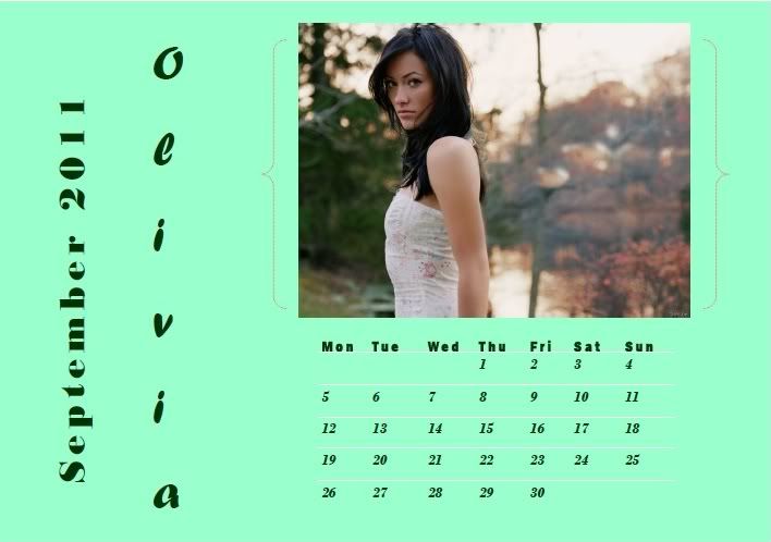
Amanda: I like this. It definitely signifies the start of fall and probably fits best for October (which was taken before you got on, so that's fine). I love your face, as it sort of looks like winter is coming - I get a slight chill from it, but a good one. You stand out in this photo for sure, as the background is... a bit blurry. That's my biggest issue with it, really - it's hard to see what's all going on, although the leaves are clearly changing colors.
All in all, good job!
Sonam: What I love the most about this photo is your face expression. It was so different from last week. At first, I don't like it but it grow on me. Another good week for you, Olivia
Mandy: I like the facial expression, and it's definitely something atypical for traditional modelling stuff, but in a good way. Not a huge fan of your shoulder, as it almost makes me think you're sulking or pouting about something, and that's a bit bizarre to me. But it's a strong shot, and you've done well.
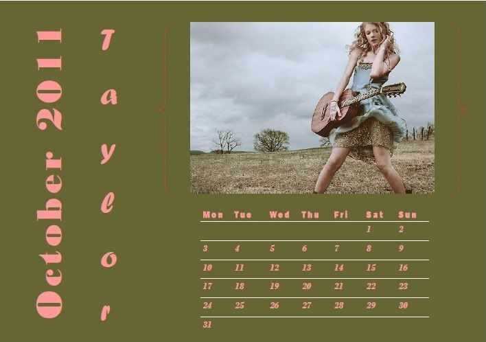
Amanda: Write a song about it! Oh wait, you're graphic design, not music. lol sry
All I can say is that it IS perfect for October. It also has a bit of a Halloween feel if you ask me, mixed with a tinge of metal [although Taylor is pop so...]
But I can't really say any more because it's that damn good. Totally perfect for a calendar. A bit sexy. And aggressive. I like it. A lot.l
Sonam: I love this one. I think you look great and I love the background. Good Job, Taylor
Mandy: Professor: Mandy Moore, why are you typing? I'm not actually lecturing yet.
Mandy: I'm... umm... taking notes about the stuff we discussed last week.
So, due to me getting busted and having to pathetically pretend that I'm not abusing my campus wi-fi during Political Philosophy, I'm not going to have anything cool to say.
I like the pose and the hair a lot, and you nailed the theme. Good job, Taylor!
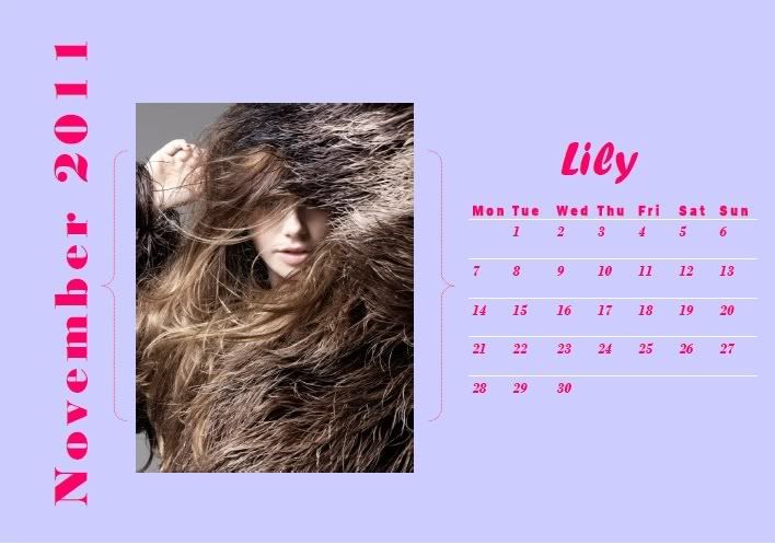
Sonam: So this is November right.. Is that a coat. I think it's very unique and risky. But we want to see your eyes. This is too high fashion for a Calendar shoot.
Amanda: Is it just me, or is a grizzly bear attacking you? I can hardly see you here - it's like you're being eaten alive, and like Sonam, I take issue with being unable to see your eyes. This is one reason why I prefer a hat to sunglasses - my eyes can still stand out.
I like the uniqueness, but if this were on my calendar, I'd spend more time trying to figure out what it is than anything. I don't like it that much, but it is a risk and it is something different, so you get points for that. It just looks like your face is buried in a grizzly bear...
Mandy: Interesting. I kind of like the fur element, and I do sympathize with you, since you pretty much got saddled with one of hardest months in the whole calendar.
I agree that it's pretty hard to actually see you in the photo, and that it almost goes a bit too far, past the realm of high fashion and into outright "WTF" territory, but at the same time I do recognize what you were trying to pull off here, and I think this would have easily been a top-tier photograph if we'd been able to see more of you, because I'm in love with the way the hair melts into the fur.
(For the record, sometimes in situations like this, if you tell Google to find images that are visually similar, you can find other photos from the same shoot. That definitely helped me out on numerous occasions last season)
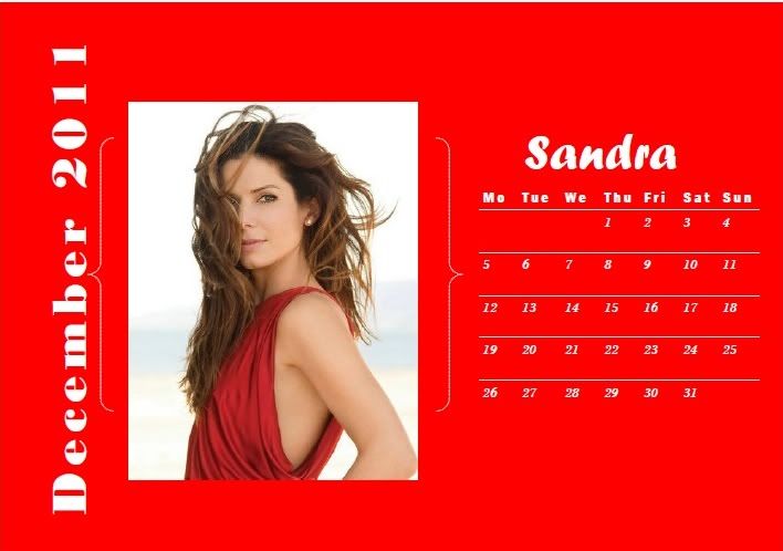
Amanda: Red works for Christmas, but being on a beach doesn't completely fit with December - when one thinks December, they think one of two things:
It's the most wonderful time of the year
With the kids jingle belling and everyone telling you "Be of good cheer"
It's the most wonderful time of the year
OR
It's the least wonderful time of the year
With essays unmoving, big exams that are looming, and lots of root beer!
It's the least wonderful time of the year!
Last year I was the latter.
Now the beach scene could be seen as a contrast to the cold holidays most people associate with December and invoke a desire to go somewhere warmer, which for me doesn't usually come forth until January when the hair I've pulled out grows back. I don't completely see how it fits the month, really. I like the red and I like the contrast, but it doesn't strike me as "December."
Although I do love your hair, I don't like that I can't see your right eye. It detracts the focal point from your face and puts it on your hair. Are you sure you want that?
Aside from my gripe about the eye, it's a very good photo, but doesn't completely go with your month. Good, but not great.
Sonam: Lol Amanda!!! I love the simplicity of this photo. You look very elegant. You were left with December and I think you did great in translating the red color to Christmas.. Congrats Sandra.
Mandy: I'll agree that it's a little bit of a stretch.
I like the hair in this photo, and I think the outfit is fantastic, but I'm a bit iffy on the fact that we can't see your right eye at all. It almost makes it look like someone turned on a fan just as the picture was taken. Still, it's a solid effort. Good job!
[/b]
Welcome to your Second Judging Session!!! This week, you have choose a month and translate it into your photo to be used for ANTM Cycle 5 Calendar
Let's start our judging session now!!!

Mandy: I definitely do see where you were going with this, and I think it's a very creative use of the theme! I totally love the facial expression here, it's flirty and adorable! The makeup is great, the earrings are great (and match the balloons, omahgash!)
One thing I'll note, though, is that the balloons definitely seem to dominate the photo, and we hardly get to see anything of your body in this shot, so that's a bit disappointing, but nothing kill-worthy, I'd say...
Sonam: I love this one. One of my favorite photo this week. You look very energetic, fresh and I love the styling in this photo.
Amanda: I'm completely with Mandy here - the photo is great and a creative, somewhat risky use of the theme and although it's definitely retro, it works. The main issue is indeed the balloons which seem to distract the image from you, even though it's a fun, festive shot. We want to see YOU here. This isn't too big a problem, and there's no chance you're getting popped this week if you know what I mean.
Very strong, and very appropriate for a calendar.

Mandy: Amber, I love a lot of things about this photo. I love the vintage feel to it, and I love the outfit and the overall style that you have going on here. It's a neat and original pose, your hair is great, it's very classy, and it fits your month to a tee.
However, I'm not a fan of the photo quality. It almost seems a bit overexposed, and lot of the finer detail is lost. But other than that, it's a phenomenal shot.
Amanda: I don't completely like how the vintage feel contrasts with the other girls' images and in a way, this sort of feels like it's from a completely different calendar; it's not the kind of shot we expected, but that's more a good thing than a bad one. I am with Mandy in that it's been tampered with a bit too much by something like Photoshop.
But aside from my little gripes here, it IS a great shot and fits the month perfectly. Pretty much everything else works great and I foresee you getting high marks once again.
Sonam: I like this one, Amber. You look very comfortable here and I get the February vibe in this photo.

Amanda: I understand that all of the summer months were taken, and although this is a good picture, there are a few fundamental problems:
1. It's a bikini pic. Except to please Ethan, do you wear bikinis in March?
2. The resolution is really really low - it's tiny, and we don't get to see some things in full detail
3. The "green" theme you mention really isn't present or focused, and things seem TOO green for March, when the snow is melting and life starts anew. This seems like life has already restarted.
You should pace yourself more in the future. Look around for a good picture with a good resolution and not just run headfirst into things. I know bikinis are your specialty but... it just doesn't seem to be appropriate for anything other than a swimsuit calendar, where all of the pics are like this. It wouldn't stand out there since it's cropped poorly.
If you do make it to next week, which I hope you do, think things through a bit before just posting something. Perhaps create a thread to compare images side by side using the [/img] tags - that's how I'd do it. Find the one that works, maybe even before choosing your month. Give us a great photo that works for the theme, else you'll end up like Jennifer. We don't want that.
Sonam: Well Amanda just said everything.. Hmm.... I wish we could see this photo more detailed. I think last week you really impressed us but this week not so much.. Sorry Jenna
Mandy: I'd say it depends where you live. In Florida you could probably get away with that all year round.
There's been a lot of stuff said already, but I'm going to come up with my own critique anyway because that's just how I roll. I definitely see where you were going with the greenery here, Jenna, and I like the pose that you have going on. I'm a bit iffy on the facial expression, though, because it almost looks bored, to me. I do wish you'd had a bigger photo, as well.

Amanda: This is way, way better than last week. This definitely seems spring-like and definitely feels like a calendar photo. I really like your hair and the flowers you've picked - it's a nice, gentle shot that is appropriate for your chosen month. Not to mention it's definitely a model shot too.
The biggest gripe I have is that fence. It seems to distract from you and seems out of place. Fences are no fun...
But yes, huge improvement. Amanda likey.
Sonam: I agree this is way better than last week. We got to see your face and your features. Your skin is flawless and I think you have a great week. My only problem is your mouth. Still stiff.. Relax it
Mandy: I like the pose and the facial expression you have here, and you did an excellent job on matching the theme! Such a step up from last week, Evan! One thing I will say, though, is that the coloring in this photo seems a little bit drab. When I work with pictures like this, I generally tweak the contrast a little, which you can do in just about any photo editing program. It's a little extra work, but it'll get you better results.

Amanda: Those are sunflowers, and they don't bloom in May. From my experience, they're usually in bloom in July and August and are most commonly associated with summer. This picture doesn't fit with May - it seems too early in the year. My calendar just has random pics of me for random months, but most of them are similar Survivor pics... and you only have one to win us over with.
I also don't like how your bangs are falling over your face - since your head is tilting to the side, we don't get to see much of your expression; a profile shot really doesn't make the most sense here, since this is the image people will look at when checking their schedule. I can hardly make out your eyes and the resolution is low... and I really don't see a focal point here. YOU need to stand out here, and this image makes the flowers sort of engulf you.
I don't mean to be rude... but I don't really like it. There are too many issues with it. Since July was available, you should have picked that and you would have done a heck of a lot better. Sorry.
Sonam: Wow Amanda... I learn a lot of things from your critiques. Kinda remind me of Mrs Danielle, my junior high school science teacher. Well back to your photo. I love the profile shot. I think you should close your mouth. I actually love the simplicity of this photo. The sunlight and the hat for me fit the May. Good luck
Mandy: Eh, I didn't know that about the sunflowers either, and my guess is that neither will the average person at home. While I agree with Amanda that the blooming thing is indeed an issue, I'm going to choose to overlook it. To me, modelling is about what looks good, not about what's true. (Case in point, if it was more about truth than looks, we wouldn't wear makeup.)
I think that this is a step up from last week's photo, and you definitely did try to deliver something that wasn't safe. I think it's an interesting shot, and I find the pose intriguing and creative. Wish we could see more of your outfit, and it's a bit hard to make out your facial expression here, but overall it's quite an improvement.

Sonam: You look very sweet and I can feel the June vibe in this photo. But be careful with your smile. Sometimes, you don't have to be too wide with your smile. But overall, you did great, girl
Amanda: Although I can definitely feel the summer here, this photo isn't as memorable as the last one. I do like the smile - mine's really wide too - and it's a pretty, relaxing photograph. It just isn't as memorable as yours last week, but I don't think it's too big a problem. Good job!
Mandy: I think that this picture is very wonderful and sweet, and it fits the theme really well. The facial expression is great, the pose is very classy, and overall it's quite attractive. My one criticism would be that color-wise it seems a tad plain, but that's not really a negative thing, since calendars tend to do that pretty often. Overall, I think you're very strong this week.

Amanda: This shot is great in a lot of ways. I like how you tie in the birthstone and use a very summery photo - is that a tan you have going? It's a beautiful shot and it definitely fits July well and I can totally see this going well with a calendar. No angel fish either! Great work :-)
Mandy: You definitely were creative on this one, Natalie, and I'll give you some definite props for putting the effort into doing your research. That being said, I'm not really a fan of the facial expression in this photo, there's just something about it that's off-putting. But the gown is great, and the hair and makeup are geat, so it's a great photo from where I'm standing.
Sonam: You look good as usual but I'm not really a fan of this photo. Maybe I'm expecting a modeling shoot. However.. I love your neck here. Very long and delicious

Sonam: Gorgeous. Very fashionable for me. I love the styling. Simple and stunning. Overall, I don't really have much problem with your photo this week, Ziyi
Amanda: I'm not completely feeling that hat - it completely camouflages your hair and it almost looks like you're wearing it to cover up baldness; perhaps if it was higher-res, we'd be able to see it better. It also doesn't seem to be the kind of hat you'd wear for "fun in the sun" like mine is:

I love my hat.
Getting back on track, yours doesn't really seem like a "summery" sort of outfit - it seems more like a formal occasion. It does strike me as a summery formal occasion, though, so I'll give you that - it's just that you're not selling it for what it should be. This still is a summer/fall outfit, though, so it works for the theme despite my being nitpicky. It's a very nice photo, I'm just trying to be picky! I don't even know why! I'm getting carried away!
so yeah it works.

Sonam: I think your hat should enter the competition next cycle, Amanda.. and I'm so going to name next cycle as ANTM Cycle 6: Awesome..
Mandy: I just about died laughing when I read that. XD
Sonam, you win. So much.
Anyway, on to my actual critique of Ziyi's photo.
I like the photo, and I like your explanation, but for some reason this just doesn't scream August to me. However, I love the facial expression, and I love your outfit and accessories. The pose is incredibly high fashion, and you look flawless here. Great job!
Amanda: That IS win on so many levels. XDDDDDDDDDD
I'll gladly enter my hat in the next competition!


Amanda: I like this. It definitely signifies the start of fall and probably fits best for October (which was taken before you got on, so that's fine). I love your face, as it sort of looks like winter is coming - I get a slight chill from it, but a good one. You stand out in this photo for sure, as the background is... a bit blurry. That's my biggest issue with it, really - it's hard to see what's all going on, although the leaves are clearly changing colors.
All in all, good job!
Sonam: What I love the most about this photo is your face expression. It was so different from last week. At first, I don't like it but it grow on me. Another good week for you, Olivia
Mandy: I like the facial expression, and it's definitely something atypical for traditional modelling stuff, but in a good way. Not a huge fan of your shoulder, as it almost makes me think you're sulking or pouting about something, and that's a bit bizarre to me. But it's a strong shot, and you've done well.

Amanda: Write a song about it! Oh wait, you're graphic design, not music. lol sry
All I can say is that it IS perfect for October. It also has a bit of a Halloween feel if you ask me, mixed with a tinge of metal [although Taylor is pop so...]
But I can't really say any more because it's that damn good. Totally perfect for a calendar. A bit sexy. And aggressive. I like it. A lot.l
Sonam: I love this one. I think you look great and I love the background. Good Job, Taylor
Mandy: Professor: Mandy Moore, why are you typing? I'm not actually lecturing yet.
Mandy: I'm... umm... taking notes about the stuff we discussed last week.
So, due to me getting busted and having to pathetically pretend that I'm not abusing my campus wi-fi during Political Philosophy, I'm not going to have anything cool to say.
I like the pose and the hair a lot, and you nailed the theme. Good job, Taylor!

Sonam: So this is November right.. Is that a coat. I think it's very unique and risky. But we want to see your eyes. This is too high fashion for a Calendar shoot.
Amanda: Is it just me, or is a grizzly bear attacking you? I can hardly see you here - it's like you're being eaten alive, and like Sonam, I take issue with being unable to see your eyes. This is one reason why I prefer a hat to sunglasses - my eyes can still stand out.
I like the uniqueness, but if this were on my calendar, I'd spend more time trying to figure out what it is than anything. I don't like it that much, but it is a risk and it is something different, so you get points for that. It just looks like your face is buried in a grizzly bear...
Mandy: Interesting. I kind of like the fur element, and I do sympathize with you, since you pretty much got saddled with one of hardest months in the whole calendar.
I agree that it's pretty hard to actually see you in the photo, and that it almost goes a bit too far, past the realm of high fashion and into outright "WTF" territory, but at the same time I do recognize what you were trying to pull off here, and I think this would have easily been a top-tier photograph if we'd been able to see more of you, because I'm in love with the way the hair melts into the fur.
(For the record, sometimes in situations like this, if you tell Google to find images that are visually similar, you can find other photos from the same shoot. That definitely helped me out on numerous occasions last season)

Amanda: Red works for Christmas, but being on a beach doesn't completely fit with December - when one thinks December, they think one of two things:
It's the most wonderful time of the year
With the kids jingle belling and everyone telling you "Be of good cheer"
It's the most wonderful time of the year
OR
It's the least wonderful time of the year
With essays unmoving, big exams that are looming, and lots of root beer!
It's the least wonderful time of the year!
Last year I was the latter.
Now the beach scene could be seen as a contrast to the cold holidays most people associate with December and invoke a desire to go somewhere warmer, which for me doesn't usually come forth until January when the hair I've pulled out grows back. I don't completely see how it fits the month, really. I like the red and I like the contrast, but it doesn't strike me as "December."
Although I do love your hair, I don't like that I can't see your right eye. It detracts the focal point from your face and puts it on your hair. Are you sure you want that?
Aside from my gripe about the eye, it's a very good photo, but doesn't completely go with your month. Good, but not great.
Sonam: Lol Amanda!!! I love the simplicity of this photo. You look very elegant. You were left with December and I think you did great in translating the red color to Christmas.. Congrats Sandra.
Mandy: I'll agree that it's a little bit of a stretch.
I like the hair in this photo, and I think the outfit is fantastic, but I'm a bit iffy on the fact that we can't see your right eye at all. It almost makes it look like someone turned on a fan just as the picture was taken. Still, it's a solid effort. Good job!
[/b]

