Post by Sonam Kapoor on Sept 29, 2011 9:11:11 GMT -5
Hello Girls!!!
Welcome to your Final Judging Session before the Finale next week!!! Only 2 models will continue their journey to compete in the Red Carpet Challenge next week
Let's start our judging session
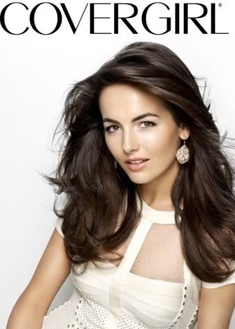
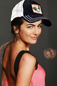
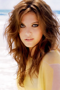
Sonam: I think you look very elegant... I love the styling. Very fresh. I still think your face a little bit stiff. I think you can do better with your mouth especially with your lips. But overall this is beautiful for me
Tom: I'll agree with Sonam this is very beautiful and elegant but it's also very plain i wish it wowed me more.
Amanda: I've been waiting for the others to come give their critiques because I haven't been completely sure how I felt about this photo. Your expression is a bit blank, like Sonam said, and I think the reason why I waited to judge is as Tommy put it: It's just plain. It's beautiful and very appropriate for the theme, but it's also forgettable. There's nothing stellar about your face, it's just blank! I really want to like it, but I'm just not sure how much I do. Sorry, Camilla. You have been one of my favorites but I'm not completely sure if this will get you into the finals. It might, it might not. I can't really tell.
Brody: I really like the angle you have your head tilted and the way your hair is blown back looks great. But I'm not so sure how this fits the theme. I don't see much from your lips.
Mandy: This is a great photo! Your facial expression looks a bit quizzical, though, as though the cameraman has just offered you a hamster sandwich or something.
But, that aside, your outfit is great, the background works beautifully, and your earrings are delightful. Great job, girl!
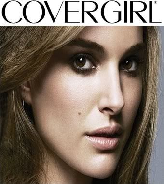
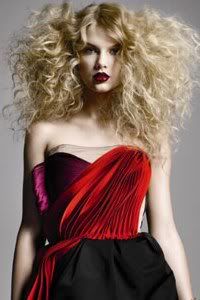
Amanda: I'm not completely sold on the quality or the cropping job here - it's a little too zoomed in. However, the focus is on both your lips and eyes an I could see a fuller version of this shot on a cover, that's for sure. It's a stunning photo and your face is amazing. I love it, I really do, and I think you have a shot at making the finale!
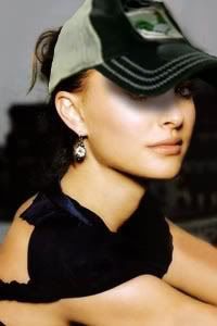
Sonam: I'm not sure about this Natalie.. Once again your photo look like it was badly-cropped... I wish we can see this with full face. This is not working for me Natalie
Tom: I think you look flawless in thsi photo but i will agree with wanting to see your full face
Brody: This image is good, but I'm not really sure about your complexion. It doesn't look very smooth.
Mandy: Natalie, Natalie, Natalie.
Here's what I think about this shot. I think you definitely emphasized the makeup and the brand, which is a component that we're definitely looking for in Covergirl shoots. I'm a little bit iffy on the coloring of the photo, because it feels a tad drab to me, and if I were to see an advertisement like that, I wouldn't be terribly impressed. It's a beautiful shot, and what we see here works, and works well.
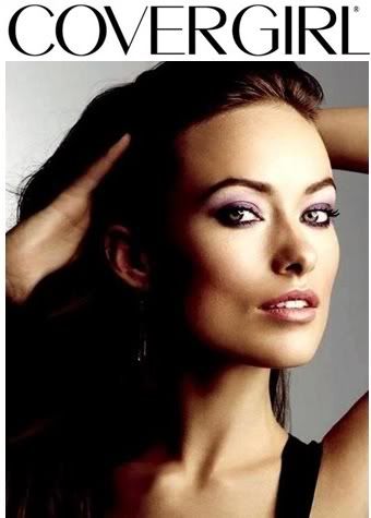
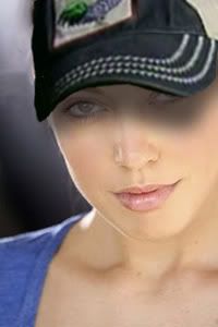
Brody: I really like the lighting and angle of this shot. The image is a little blurry around your face, Perhaps I would have focused more on your face and not so much of your upperbody. Also, I'm not sure I like how dark it is on the one side of your face.
Tom: If it's any time to shine this was your chance and you pulled it off. Out of the other two i've judged so far this is my favorite. You have a good shot at making it to the next round. great job. Your eyes, lips and skin is flawless. Only thing i can say i dont like is your arms. Other then that this is good.
Amanda: That dark side doesn't seem to be much of a "Cover Girl" and somewhat distracts from the photo. I tend to see this as a yin-yang thang and that's not what we're going for. I do like how your face is illuminated and your expression, but the pose somewhat distracts from your face. What we want here is something that focuses more on the FACE and the lips especially; your eyeshadow also highlights your eyes more than your lips. That earring is also kind of creepy due to the lighting.
I want to like this but I'm not sure how much I do. Sorry.
Sonam: I think you did quite good Olivia... Do I think it perfectly suit Covergirl as a Brand? No.. But I think you look very sharp and fierce. And the lips are also looks really great. I'm not really into your posing. Over-analytical for me. You should just relax and chill out
Mandy: Olivia, my dear!
You've done a fantastic job here, both in emphasizing the makeup, and in the photo itself. I'll agree that I wish the lighting was different, because the Covergirl ads that I've usually seen don't use shadow like this, but I think it's a gorgeous shot anyway.
PS, it's kind of funny that there's all this controversy about the arms... I actually edited one out of my Covergirl shot last season. Guess I made the right call. lol
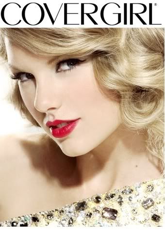
Brody: I am in love with this shot. You look perfect and I really think that you captured the whole point of the photo shoot by focusing on your lips. Also, the top you are wearing with the gems really completes the photo. Great job!
Tom: This is such a flawless and breathless picture. I love everything about it!
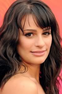
Amanda: Easy. Breezy. Beautiful. Taylor, you are the biggest threat to win this competition.
Sonam: Girl... you did fantastic!!! This is so Covergirl... i think you kill everyone this week, Taylor!!!
Mandy: I don't really know what else to say. It's a great photo, though I kind of wish it wasn't such a closeup, but that's more personal preference than anything. The hair and makeup are great, and the pose is classic Covergirl. Well done!
Welcome to your Final Judging Session before the Finale next week!!! Only 2 models will continue their journey to compete in the Red Carpet Challenge next week
Let's start our judging session

Sonam: I think you look very elegant... I love the styling. Very fresh. I still think your face a little bit stiff. I think you can do better with your mouth especially with your lips. But overall this is beautiful for me
Tom: I'll agree with Sonam this is very beautiful and elegant but it's also very plain i wish it wowed me more.
Amanda: I've been waiting for the others to come give their critiques because I haven't been completely sure how I felt about this photo. Your expression is a bit blank, like Sonam said, and I think the reason why I waited to judge is as Tommy put it: It's just plain. It's beautiful and very appropriate for the theme, but it's also forgettable. There's nothing stellar about your face, it's just blank! I really want to like it, but I'm just not sure how much I do. Sorry, Camilla. You have been one of my favorites but I'm not completely sure if this will get you into the finals. It might, it might not. I can't really tell.
Brody: I really like the angle you have your head tilted and the way your hair is blown back looks great. But I'm not so sure how this fits the theme. I don't see much from your lips.
Mandy: This is a great photo! Your facial expression looks a bit quizzical, though, as though the cameraman has just offered you a hamster sandwich or something.
But, that aside, your outfit is great, the background works beautifully, and your earrings are delightful. Great job, girl!

Amanda: I'm not completely sold on the quality or the cropping job here - it's a little too zoomed in. However, the focus is on both your lips and eyes an I could see a fuller version of this shot on a cover, that's for sure. It's a stunning photo and your face is amazing. I love it, I really do, and I think you have a shot at making the finale!
Sonam: I'm not sure about this Natalie.. Once again your photo look like it was badly-cropped... I wish we can see this with full face. This is not working for me Natalie
Tom: I think you look flawless in thsi photo but i will agree with wanting to see your full face
Brody: This image is good, but I'm not really sure about your complexion. It doesn't look very smooth.
Mandy: Natalie, Natalie, Natalie.
Here's what I think about this shot. I think you definitely emphasized the makeup and the brand, which is a component that we're definitely looking for in Covergirl shoots. I'm a little bit iffy on the coloring of the photo, because it feels a tad drab to me, and if I were to see an advertisement like that, I wouldn't be terribly impressed. It's a beautiful shot, and what we see here works, and works well.

Brody: I really like the lighting and angle of this shot. The image is a little blurry around your face, Perhaps I would have focused more on your face and not so much of your upperbody. Also, I'm not sure I like how dark it is on the one side of your face.
Tom: If it's any time to shine this was your chance and you pulled it off. Out of the other two i've judged so far this is my favorite. You have a good shot at making it to the next round. great job. Your eyes, lips and skin is flawless. Only thing i can say i dont like is your arms. Other then that this is good.
Amanda: That dark side doesn't seem to be much of a "Cover Girl" and somewhat distracts from the photo. I tend to see this as a yin-yang thang and that's not what we're going for. I do like how your face is illuminated and your expression, but the pose somewhat distracts from your face. What we want here is something that focuses more on the FACE and the lips especially; your eyeshadow also highlights your eyes more than your lips. That earring is also kind of creepy due to the lighting.
I want to like this but I'm not sure how much I do. Sorry.
Sonam: I think you did quite good Olivia... Do I think it perfectly suit Covergirl as a Brand? No.. But I think you look very sharp and fierce. And the lips are also looks really great. I'm not really into your posing. Over-analytical for me. You should just relax and chill out
Mandy: Olivia, my dear!
You've done a fantastic job here, both in emphasizing the makeup, and in the photo itself. I'll agree that I wish the lighting was different, because the Covergirl ads that I've usually seen don't use shadow like this, but I think it's a gorgeous shot anyway.
PS, it's kind of funny that there's all this controversy about the arms... I actually edited one out of my Covergirl shot last season. Guess I made the right call. lol

Brody: I am in love with this shot. You look perfect and I really think that you captured the whole point of the photo shoot by focusing on your lips. Also, the top you are wearing with the gems really completes the photo. Great job!
Tom: This is such a flawless and breathless picture. I love everything about it!
Amanda: Easy. Breezy. Beautiful. Taylor, you are the biggest threat to win this competition.
Sonam: Girl... you did fantastic!!! This is so Covergirl... i think you kill everyone this week, Taylor!!!
Mandy: I don't really know what else to say. It's a great photo, though I kind of wish it wasn't such a closeup, but that's more personal preference than anything. The hair and makeup are great, and the pose is classic Covergirl. Well done!



 Congrats Tay Tay and Olive
