|
|
Post by Natalie Portman on Sept 27, 2011 17:41:02 GMT -5
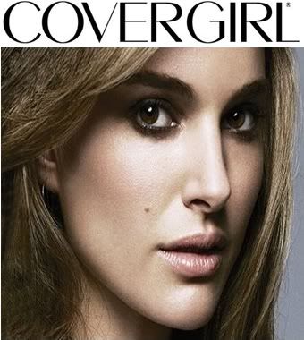
 This is your Official Covergirl Ad  <3 |
|
|
|
Post by Amanda Kimmel on Sept 27, 2011 21:26:17 GMT -5
I'm not completely sold on the quality or the cropping job here - it's a little too zoomed in. However, the focus is on both your lips and eyes an I could see a fuller version of this shot on a cover, that's for sure. It's a stunning photo and your face is amazing. I love it, I really do, and I think you have a shot at making the finale!
|
|
|
|
Post by Sonam Kapoor on Sept 28, 2011 5:57:09 GMT -5
Sonam: I'm not sure about this Natalie.. Once again your photo look like it was badly-cropped... I wish we can see this with full face. This is not working for me Natalie
|
|
|
|
Post by Natalie Portman on Sept 28, 2011 6:32:40 GMT -5
I went off of Amanda's photo from all-stars.
|
|
|
|
Post by Tom Welling on Sept 28, 2011 13:11:36 GMT -5
Tom: I think you look flawless in thsi photo but i will agree with wanting to see your full face
|
|
|
|
Post by Brody Jenner on Sept 28, 2011 14:35:55 GMT -5
This image is good, but I'm not really sure about your complexion. It doesn't look very smooth.
|
|
|
|
Post by Mandy Moore on Sept 29, 2011 0:43:23 GMT -5
Natalie, Natalie, Natalie.
Here's what I think about this shot. I think you definitely emphasized the makeup and the brand, which is a component that we're definitely looking for in Covergirl shoots. I'm a little bit iffy on the coloring of the photo, because it feels a tad drab to me, and if I were to see an advertisement like that, I wouldn't be terribly impressed. It's a beautiful shot, and what we see here works, and works well.
|
|