Post by Sonam Kapoor on Sept 10, 2011 11:21:14 GMT -5
Hello Girls
Welcome to your Third Judging Session
This week, you need to submit a Magazine Cover for us. Let's start our business

Sonam: I think this is super gorgeous. I love the pose. Very stylish and I think you look fierce in this shoot!!!
Mandy: This is a great shot! I love the intimidating pose, and your hair looks fantastic. Your accessories add a lot to the photo, which is good since single-color dress shots tend to get extremely bland. Another fantastic shot from you!
Amanda: I hate the "LET'S SHOP" tattooed across you, but the pose, the dress, the face... all awesome. You stand out a lot here and that's a very good thing on a magazine rack. Really, the only issue I have is that text is so huge that it's distracting. Not much you can do about that, though

Sonam: I love the styling but I think you could relax your mouth more. Overall it is a good photo but I think you could do better than this
Mandy: You are frighteningly skinny in this photo. Like, I want to drag you to McDonald's and make you eat a Big Mac, so that your spine doesn't snap in half level of skinny.
But I love the facial expression, you look fierce and feisty, the outfit is gorgeous, and your hair is to die for. This is a fantastic shot, girlfriend!
Amanda: VERY awesome job in all departments here. Although yes, you do look skinnier than Courtney, it's a sexy photo with a sexy outfit and you clearly mean business. The hair is amazing and you definitely stand out a LOT.
I like it. A lot.

Sonam: Another superb styling this week. I love this photo because you look glam and elegant at the same time. But I think you can work more on your face expression. But I like this photo, Ev
Mandy: That outfit is like whoa! I like how it kind of fades into the white, so that it makes you stand out from the background a lot more, and that's crticial in a magazine shot. The facial expression is fierce and I absolutely love it. Well done!
Amanda: I really have nothing else to add. I'm not a fan of your face, either, but the outfit and pose are stunning. You really are the center of attention here, even with that ugly pink font they pasted over you. (I'm also not fond of the Spanish but that doesn't matter). Very good overall!

Mandy: THIS is what we've been waiting for!
I love this photo, Julia. It's very sleek and streamlined, and very classy, which is difficult to pull off. Usually a classy photo has the attractiveness of a piece of burnt wheat toast, but you've managed to pull it off incredibly well. The facial expression seems a tad awkward, but the hair, the outfit and the pose really shine here. Well done!
Amanda: Yeah, your face looks sort of like a zombie mime of sorts. It's creepy and I'm turned away a bit by it. The text on you is also a bit awkward and is hard to read. Everything else... amazing. Your hair, your dress, pose... huge improvement over the past two weeks. Great work!
Sonam: I think this is slightly better than last two weeks. I love the styling but I just can't help but thinking that this is kinda outdated. Good effort anyway

Mandy: Ho-Lea crap, this is good! The pose you have going on here is incredible, the sultry look-back-over-your-shoulder thing is coy and flirty to the max, and it's a great shot. The accessories are fantastic, and they totally enhance the shot. However, one thing I will point out is that white outfits on a white background are generally a bad idea, if only because it's very, very easy to lose the outfit completely into the background, and that definitely happened for me in this case. I legit did a double-take because on the first glance you looked like you weren't wearing anything at all. (Yet another reason never to judge these things in Starbucks). In the future, I'd recommend saving the picture and either upping the contrast a bit, or darkening it, so that it's easier to see the boundaries, so to speak.
Amanda: There is a lot of text on the magazine as well, and with the white-on-white, that is a problem. The pose is striking and very, very sexy, and your smile is awesome. Everything about your shot goes perfectly, but it does look like you're almost naked. (I'm hoping my grandma did not see that). I also hate the text on your hair, but blame the publisher for that. They try to fit too much on a cover and that sucks. But overall, this is a VERY fetching photograph and overall a great job!
Sonam: I think this is gorgeous!!! My favorite photo from you, Lea.. You did well this time compare to your last cycles. I think you're one of the frontrunner for this cycle

Amanda: This is a very sweet, genuine photograph that would totally stand out on a grocery store magazine rack. Although the huge text is somewhat distracting, my eyes are still drawn to you. This is obviously a promo and focuses completely on it - there are no off topic headlines that would stray the thoughts of a person reading the cover. Great work!
Mandy: Lily, this picture is absolutely stunning! I love what you have going on with your hair, and your eyes are absolutely gorgeous in this photograph. I also like that you found a magazine cover that doesn't steal the focus away from you with a bunch of wordy gabbledygook, which lets us see your beauty. The outfit is beautiful, too. Overall, fantastic job!
Sonam: I love your lips in this photo and I think you look fresh, energetic and modelesque. But I still think you can improve with your eyes. A little bit dead for me. Other than that, it was a great photo

Sonam: I love the black background. Because it makes you stand out more. The styling are classy and elegant and I think you did a good job this week
Mandy: This is fantastic! Your smile here is absolutely enchanting, and your accessories add just that perfect little touch to the picture, plus your outfit is silky and delicious. It's a very classy photograph, and a great choice for you!
Amanda: I don't like that black thing in your hair but that's really my only gripe with this. The smile is awesome. The jewelry is awesome. The pose is awesome. And the color scheme goes well with your outfit. Not much more to say - great work!
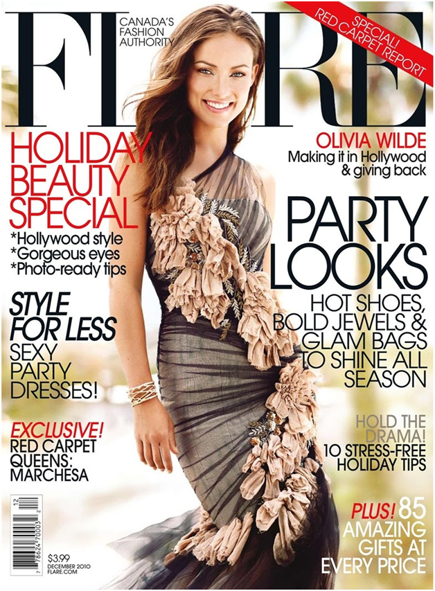
Mandy: Wow. Olivia, this is fantastic! Your facial expression is absolutely adorable, and even though ruffles and flowery bits tend to make me want to die a little inside, you're actually pulling it off and making it look awesome! The only gripe I'd have for you here is that I'm not a fan of your arm. It's just kind of hanging there weirdly, and not really contributing anything. Like, if your anatomy was the cast of House, that arm would be Foreman. But, again, this is freakin' awesome.
Amanda: There does seem to be a lot of text everywhere, but you stand out like a lighthouse. Perhaps that's because of the flowers which look strange but go well with everything else. I do agree that the arm is a tad awkward but the pose and styling are fantastic - great work!
Sonam: Stunning. I think one of the Best Cover I saw. You look very approachable and that couture!!!! *Die.. I'm so going to wear it while I'm shopping for my groceries. Stand out for me!!!
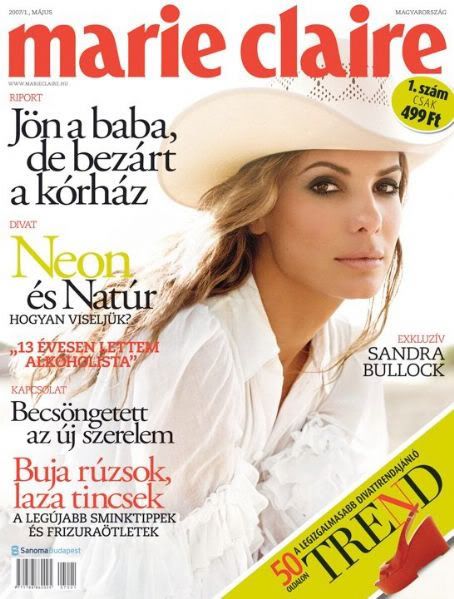
Mandy: I'm of two minds about this picture. I think that your face is very strong in this photo, and I really like what you've done with your hair here.
However, and I've said this to other models as well, I'm not a fan of the white-on-white thing that you have going on here. It tends to make you fade into the background, and draws more focus to the words than it actually does to you, and that's not a good thing in a competition like this. In the future, if you're going to do something like this, I'd strongly recommend editing the picture yourself, either darkening or contrasting, so that you we can see you more clearly.
Amanda: My eyes are first drawn to that yellow-and-red bar in the lower right-hand corner. It's the only word aside from the title and your name I can actually read, and that is partly due to the white-on-white thing. It's a nice outfit and your face, hair, and hat are great, but it's sort of hard to see because of the white background. It's a good effort but the whiteness of it makes you less of a focus. I don't think you should worry, though! It's still good stuff.
Sonam: I think you look okay in this photo. I like the styling and the pose too but it just didn't stand out for me and I'm a fan of Sandra Bullock and I have a lot of magazine with her in the cover which i preferred me like these


Amanda: You showed me a ton of samples last night... and I must say that this is unquestionably better than most of those. Like you said, most of the others had cluttered text in unusual places which detracted from the focus on you. Here there isn't a problem with that and if I was in line at the grocery store, I would notice Taylor as opposed to a stupid gossipy headline. I also really like the shot - good, clean, and focused while still staying true to character. Very nice job!
Mandy: What the crap, I didn't respond to this already? Yay memory loss!
Okay, let's see. I love your facial expression here, Taylor! I'm generally not a fan of the hair falling into the eyes, but in this case it looks fierce and I quite like it. The outfit is pretty interesting, and I like how it's grungy and rebellious, but doesn't completely detract from your femininity. Great work!
Sonam: I love the hair falling into the eyes actually. Sexy.. I did that all the time. Sometimes I hit the wall because I couldn't saw what's in from of me. Your photo is stunning. The styling and the pose are strong enough and it works with the face reaction.

Mandy: Not gonna lie, the first thing I did when I saw this was to stop and figure out whether that dark bit on the right is a shadow or your shoulder. I'm pretty sure it's a shadow, because if it's your should you're going to have some pretty serious chiropractic issues.
I love the intensity of your face, (your eyes, especially. It's almost spooky) and your makeup is flawless here! I do wish we could see a bit more of your hair and outfit in this photo, but everything that's here is absolutely incredible.
Amanda: I'm not a huge fan of the way the text covers you everywhere and how the red makes your lipstick stand out less. I also think the lighting is really funky because of the shadow Mandy mentions. But your face, makeup, and pose are amazing - everything works perfectly, it's just covered by the text to the point that it takes away from you. Of course, that's not your fault, but it could be a little room for improvement. All-in-all, great work!
Sonam: I love the pose. Awkward but stunning. This is my favorite photo from you. Your skin is flawless.. I'm still wondering though if it was your arm or your shadow but the face is simply stunning
Welcome to your Third Judging Session
This week, you need to submit a Magazine Cover for us. Let's start our business

Sonam: I think this is super gorgeous. I love the pose. Very stylish and I think you look fierce in this shoot!!!
Mandy: This is a great shot! I love the intimidating pose, and your hair looks fantastic. Your accessories add a lot to the photo, which is good since single-color dress shots tend to get extremely bland. Another fantastic shot from you!
Amanda: I hate the "LET'S SHOP" tattooed across you, but the pose, the dress, the face... all awesome. You stand out a lot here and that's a very good thing on a magazine rack. Really, the only issue I have is that text is so huge that it's distracting. Not much you can do about that, though


Sonam: I love the styling but I think you could relax your mouth more. Overall it is a good photo but I think you could do better than this
Mandy: You are frighteningly skinny in this photo. Like, I want to drag you to McDonald's and make you eat a Big Mac, so that your spine doesn't snap in half level of skinny.
But I love the facial expression, you look fierce and feisty, the outfit is gorgeous, and your hair is to die for. This is a fantastic shot, girlfriend!
Amanda: VERY awesome job in all departments here. Although yes, you do look skinnier than Courtney, it's a sexy photo with a sexy outfit and you clearly mean business. The hair is amazing and you definitely stand out a LOT.
I like it. A lot.

Sonam: Another superb styling this week. I love this photo because you look glam and elegant at the same time. But I think you can work more on your face expression. But I like this photo, Ev
Mandy: That outfit is like whoa! I like how it kind of fades into the white, so that it makes you stand out from the background a lot more, and that's crticial in a magazine shot. The facial expression is fierce and I absolutely love it. Well done!
Amanda: I really have nothing else to add. I'm not a fan of your face, either, but the outfit and pose are stunning. You really are the center of attention here, even with that ugly pink font they pasted over you. (I'm also not fond of the Spanish but that doesn't matter). Very good overall!

Mandy: THIS is what we've been waiting for!
I love this photo, Julia. It's very sleek and streamlined, and very classy, which is difficult to pull off. Usually a classy photo has the attractiveness of a piece of burnt wheat toast, but you've managed to pull it off incredibly well. The facial expression seems a tad awkward, but the hair, the outfit and the pose really shine here. Well done!
Amanda: Yeah, your face looks sort of like a zombie mime of sorts. It's creepy and I'm turned away a bit by it. The text on you is also a bit awkward and is hard to read. Everything else... amazing. Your hair, your dress, pose... huge improvement over the past two weeks. Great work!
Sonam: I think this is slightly better than last two weeks. I love the styling but I just can't help but thinking that this is kinda outdated. Good effort anyway

Mandy: Ho-Lea crap, this is good! The pose you have going on here is incredible, the sultry look-back-over-your-shoulder thing is coy and flirty to the max, and it's a great shot. The accessories are fantastic, and they totally enhance the shot. However, one thing I will point out is that white outfits on a white background are generally a bad idea, if only because it's very, very easy to lose the outfit completely into the background, and that definitely happened for me in this case. I legit did a double-take because on the first glance you looked like you weren't wearing anything at all. (Yet another reason never to judge these things in Starbucks). In the future, I'd recommend saving the picture and either upping the contrast a bit, or darkening it, so that it's easier to see the boundaries, so to speak.
Amanda: There is a lot of text on the magazine as well, and with the white-on-white, that is a problem. The pose is striking and very, very sexy, and your smile is awesome. Everything about your shot goes perfectly, but it does look like you're almost naked. (I'm hoping my grandma did not see that). I also hate the text on your hair, but blame the publisher for that. They try to fit too much on a cover and that sucks. But overall, this is a VERY fetching photograph and overall a great job!
Sonam: I think this is gorgeous!!! My favorite photo from you, Lea.. You did well this time compare to your last cycles. I think you're one of the frontrunner for this cycle

Amanda: This is a very sweet, genuine photograph that would totally stand out on a grocery store magazine rack. Although the huge text is somewhat distracting, my eyes are still drawn to you. This is obviously a promo and focuses completely on it - there are no off topic headlines that would stray the thoughts of a person reading the cover. Great work!
Mandy: Lily, this picture is absolutely stunning! I love what you have going on with your hair, and your eyes are absolutely gorgeous in this photograph. I also like that you found a magazine cover that doesn't steal the focus away from you with a bunch of wordy gabbledygook, which lets us see your beauty. The outfit is beautiful, too. Overall, fantastic job!
Sonam: I love your lips in this photo and I think you look fresh, energetic and modelesque. But I still think you can improve with your eyes. A little bit dead for me. Other than that, it was a great photo

Sonam: I love the black background. Because it makes you stand out more. The styling are classy and elegant and I think you did a good job this week
Mandy: This is fantastic! Your smile here is absolutely enchanting, and your accessories add just that perfect little touch to the picture, plus your outfit is silky and delicious. It's a very classy photograph, and a great choice for you!
Amanda: I don't like that black thing in your hair but that's really my only gripe with this. The smile is awesome. The jewelry is awesome. The pose is awesome. And the color scheme goes well with your outfit. Not much more to say - great work!

Mandy: Wow. Olivia, this is fantastic! Your facial expression is absolutely adorable, and even though ruffles and flowery bits tend to make me want to die a little inside, you're actually pulling it off and making it look awesome! The only gripe I'd have for you here is that I'm not a fan of your arm. It's just kind of hanging there weirdly, and not really contributing anything. Like, if your anatomy was the cast of House, that arm would be Foreman. But, again, this is freakin' awesome.
Amanda: There does seem to be a lot of text everywhere, but you stand out like a lighthouse. Perhaps that's because of the flowers which look strange but go well with everything else. I do agree that the arm is a tad awkward but the pose and styling are fantastic - great work!
Sonam: Stunning. I think one of the Best Cover I saw. You look very approachable and that couture!!!! *Die.. I'm so going to wear it while I'm shopping for my groceries. Stand out for me!!!

Mandy: I'm of two minds about this picture. I think that your face is very strong in this photo, and I really like what you've done with your hair here.
However, and I've said this to other models as well, I'm not a fan of the white-on-white thing that you have going on here. It tends to make you fade into the background, and draws more focus to the words than it actually does to you, and that's not a good thing in a competition like this. In the future, if you're going to do something like this, I'd strongly recommend editing the picture yourself, either darkening or contrasting, so that you we can see you more clearly.
Amanda: My eyes are first drawn to that yellow-and-red bar in the lower right-hand corner. It's the only word aside from the title and your name I can actually read, and that is partly due to the white-on-white thing. It's a nice outfit and your face, hair, and hat are great, but it's sort of hard to see because of the white background. It's a good effort but the whiteness of it makes you less of a focus. I don't think you should worry, though! It's still good stuff.
Sonam: I think you look okay in this photo. I like the styling and the pose too but it just didn't stand out for me and I'm a fan of Sandra Bullock and I have a lot of magazine with her in the cover which i preferred me like these


Amanda: You showed me a ton of samples last night... and I must say that this is unquestionably better than most of those. Like you said, most of the others had cluttered text in unusual places which detracted from the focus on you. Here there isn't a problem with that and if I was in line at the grocery store, I would notice Taylor as opposed to a stupid gossipy headline. I also really like the shot - good, clean, and focused while still staying true to character. Very nice job!
Mandy: What the crap, I didn't respond to this already? Yay memory loss!
Okay, let's see. I love your facial expression here, Taylor! I'm generally not a fan of the hair falling into the eyes, but in this case it looks fierce and I quite like it. The outfit is pretty interesting, and I like how it's grungy and rebellious, but doesn't completely detract from your femininity. Great work!
Sonam: I love the hair falling into the eyes actually. Sexy.. I did that all the time. Sometimes I hit the wall because I couldn't saw what's in from of me. Your photo is stunning. The styling and the pose are strong enough and it works with the face reaction.

Mandy: Not gonna lie, the first thing I did when I saw this was to stop and figure out whether that dark bit on the right is a shadow or your shoulder. I'm pretty sure it's a shadow, because if it's your should you're going to have some pretty serious chiropractic issues.
I love the intensity of your face, (your eyes, especially. It's almost spooky) and your makeup is flawless here! I do wish we could see a bit more of your hair and outfit in this photo, but everything that's here is absolutely incredible.
Amanda: I'm not a huge fan of the way the text covers you everywhere and how the red makes your lipstick stand out less. I also think the lighting is really funky because of the shadow Mandy mentions. But your face, makeup, and pose are amazing - everything works perfectly, it's just covered by the text to the point that it takes away from you. Of course, that's not your fault, but it could be a little room for improvement. All-in-all, great work!
Sonam: I love the pose. Awkward but stunning. This is my favorite photo from you. Your skin is flawless.. I'm still wondering though if it was your arm or your shadow but the face is simply stunning

