Post by Sonam Kapoor on Sept 6, 2011 20:56:25 GMT -5
Hello Girls
Welcome to your First Elimination of this Cycle. This week your theme is Nature Elements and you need to pick one of the elements and translate it into your photo. Let's start our business
First Up Water
Water - Amber, Olivia, Sandra, Taylor & Ziyi

Tom: Wow this photo is stunning, beautiful and it just wows me, i'm like breathless this is so good. Great way to start the game.
Sonam: I agree with Tom and it's very elegant and beautiful. The theme was executed really well too.. Congrats!!
Amanda: A good word for this: majestic. You have this natural splendor and seem to be enjoying yourself. It goes beyond the typical water photo - I especially enjoy the water cascading from your hands. I love it.
Mandy: This is a great shot, Amber! I like that you picked a photo that has a lot going on, but doesn't distract us from you as the center of attention. The water theme is executed brilliantly, and the facial expression really captures the sublime nature of the photo. The only real negative I have for you is that I'm not really a fan of the glare, or the words at the bottom of the photo.

Tom: I'm not loving the picture. For some reason i do not see model in this. I feel like you were just chilling at the pool and someone took a photo of you. But i love the lipstick and you did pull off the theme
Amanda: Oh Tommy, I must disagree. Somewhat. The lipstick makes it pretty clear that this is a glam shot. It does go well with the theme but it isn't the most original - a basic bikini pic in a pool is something anyone can do. I do like how it looks and to me it seems like it's a model shot but that you were also having fun.
Maybe we can go for a swim sometime! ^_^
Sonam: I love your face. Very strong!!! And I definitely can see the Water element in this photo. Good start for you, Olivia!!!
Olivia: I'm wearing a dress, not a bikini aha ;D
Amanda: Looks like a lot of it blends with the water... harder to see it with lower resolutions like on my phone. Must have gotten confused with my X bikini top! xD
Mandy: ^ I've never seen Amanda in one of those. Her survivor ones have all been brown (or green in HVV, but for whatever reason she almost never wore that one), and not X-shaped. I demand proof.
But that's all beside the point. Ahem. It's a very interesting shot, and I like a lot of the elements that are present here. I'm a bit put off by the notion of a dress being worn like this, because in my head, dresses and swimming don't really go together unless you're on the Titanic, but it's an attractive pose, and I like that both your eyes and your outfit are colored to match the water, but that you have the lipstick and hair going on to keep it from being monotone. The facial expression is entrancing, and it's alluring without being trashy, which is a hard thing to pull off. Well done!
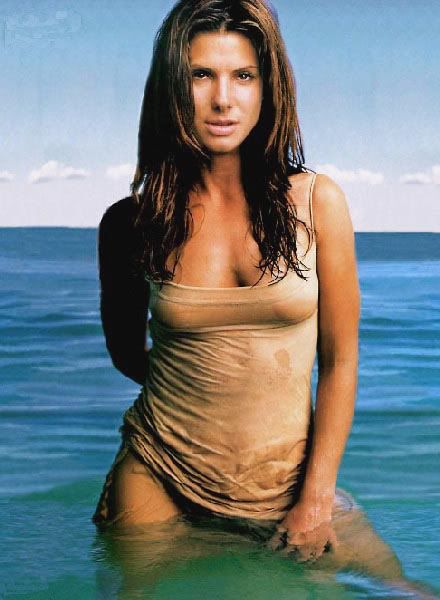
Amanda: This reminds me a lot of official LOST media or a Survivor profile pic - having done several of the latter, I can say it is sort of model like but it's still different. And in this case, different is good. I like it but I don't exactly follow the "engulfing" mentality you state. Possibly because the photo makes a point of it being shallow water. Been swimming lately?
I do find it appropriate regardless. It fits the water even though it doesn't do anything with it. Your uniqueness is merely limited to the survival theme which is usually more in an Earth category. I like how the two meet and how the water is more prevalent. Good job!
Sonam: I want you to go with the Wind/Air photos so a little bit upset. This photo was good but not really memorable... Your mouth was stiff in this one. Relax your mouth so it will look better next time
Mandy: Sandra, I think the water and wetness really come through in this photograph, and you've executed the theme here really well! However, it's a pretty poor-quality shot, and that's a definite negative in my books, since it makes it a bit harder to judge finer points, like your facial expression and hair. But the pose is very attractive, and it's a nice shot nonetheless.

Tom: This reminds me of a sort of sea goddess. I love the face, the hair and the pose. It's very pretty. I was a but nervous because i wasn't sure what you could pull off but you totally pulled this assignment off really well. Beautifully i must say.
Amanda: I pretty much concur with Tommy. The water is awesome and you look like you're floating upon a sort of mineral spring. It's a neat photo and I definitely want to splash around in there! Could you teach me how to float like that?
Sonam: I love everything except your face.. Very stiff. I don't know what expression you were translate in this photo. But I think you'll survive this week.. I want to see more emotion for you
Mandy: I think what I love most about this photo is the eyes - they really tie into the water well, and I definitely like how the blueness of this photo adds to the water theme. It's very serene and tranquil, and the pose fits nicely. I agree with Sonam that the face is kind of stiff, but overall my impressions are very positive.
.jpg)
Sonam: I love the whole background and fits the theme well. The pose was good but I want to see more on your face expression. I want more fierceness in your photo
Amanda: Fierceness? Water is supposed to be tranquil. This photo fits tranquillity perfectly and seems to be relaxed. The way it should be, although I'd rather be playing volleyball...
I like it and think it fits water well.
Tom: THis photo is very pretty but its another one i dont know if i like it or not. I like your pose and your face but the background isnt really settling with me.
Mandy: I'm trying to decide how I feel about this photo. On the one hand, it's a good shot, and you look beautiful, but I don't feel like it necessarily represents that theme as well as it should. It's a great shot, and the water is there, but the water isn't a vital piece of the photo, and there's nothing in the pose to evoke the water feeling. It's a great effort, but I feel that the theme could have been represented better. Also, as a sidenote, and I've said this to other models, but I'm not a fan of the lettering at the bottom. It's a distraction, and makes it look less professional.
Welcome to your First Elimination of this Cycle. This week your theme is Nature Elements and you need to pick one of the elements and translate it into your photo. Let's start our business
First Up Water
Water - Amber, Olivia, Sandra, Taylor & Ziyi

Tom: Wow this photo is stunning, beautiful and it just wows me, i'm like breathless this is so good. Great way to start the game.
Sonam: I agree with Tom and it's very elegant and beautiful. The theme was executed really well too.. Congrats!!
Amanda: A good word for this: majestic. You have this natural splendor and seem to be enjoying yourself. It goes beyond the typical water photo - I especially enjoy the water cascading from your hands. I love it.
Mandy: This is a great shot, Amber! I like that you picked a photo that has a lot going on, but doesn't distract us from you as the center of attention. The water theme is executed brilliantly, and the facial expression really captures the sublime nature of the photo. The only real negative I have for you is that I'm not really a fan of the glare, or the words at the bottom of the photo.

Tom: I'm not loving the picture. For some reason i do not see model in this. I feel like you were just chilling at the pool and someone took a photo of you. But i love the lipstick and you did pull off the theme
Amanda: Oh Tommy, I must disagree. Somewhat. The lipstick makes it pretty clear that this is a glam shot. It does go well with the theme but it isn't the most original - a basic bikini pic in a pool is something anyone can do. I do like how it looks and to me it seems like it's a model shot but that you were also having fun.
Maybe we can go for a swim sometime! ^_^
Sonam: I love your face. Very strong!!! And I definitely can see the Water element in this photo. Good start for you, Olivia!!!
Olivia: I'm wearing a dress, not a bikini aha ;D
Amanda: Looks like a lot of it blends with the water... harder to see it with lower resolutions like on my phone. Must have gotten confused with my X bikini top! xD
Mandy: ^ I've never seen Amanda in one of those. Her survivor ones have all been brown (or green in HVV, but for whatever reason she almost never wore that one), and not X-shaped. I demand proof.
But that's all beside the point. Ahem. It's a very interesting shot, and I like a lot of the elements that are present here. I'm a bit put off by the notion of a dress being worn like this, because in my head, dresses and swimming don't really go together unless you're on the Titanic, but it's an attractive pose, and I like that both your eyes and your outfit are colored to match the water, but that you have the lipstick and hair going on to keep it from being monotone. The facial expression is entrancing, and it's alluring without being trashy, which is a hard thing to pull off. Well done!

Amanda: This reminds me a lot of official LOST media or a Survivor profile pic - having done several of the latter, I can say it is sort of model like but it's still different. And in this case, different is good. I like it but I don't exactly follow the "engulfing" mentality you state. Possibly because the photo makes a point of it being shallow water. Been swimming lately?
I do find it appropriate regardless. It fits the water even though it doesn't do anything with it. Your uniqueness is merely limited to the survival theme which is usually more in an Earth category. I like how the two meet and how the water is more prevalent. Good job!
Sonam: I want you to go with the Wind/Air photos so a little bit upset. This photo was good but not really memorable... Your mouth was stiff in this one. Relax your mouth so it will look better next time
Mandy: Sandra, I think the water and wetness really come through in this photograph, and you've executed the theme here really well! However, it's a pretty poor-quality shot, and that's a definite negative in my books, since it makes it a bit harder to judge finer points, like your facial expression and hair. But the pose is very attractive, and it's a nice shot nonetheless.

Tom: This reminds me of a sort of sea goddess. I love the face, the hair and the pose. It's very pretty. I was a but nervous because i wasn't sure what you could pull off but you totally pulled this assignment off really well. Beautifully i must say.
Amanda: I pretty much concur with Tommy. The water is awesome and you look like you're floating upon a sort of mineral spring. It's a neat photo and I definitely want to splash around in there! Could you teach me how to float like that?
Sonam: I love everything except your face.. Very stiff. I don't know what expression you were translate in this photo. But I think you'll survive this week.. I want to see more emotion for you
Mandy: I think what I love most about this photo is the eyes - they really tie into the water well, and I definitely like how the blueness of this photo adds to the water theme. It's very serene and tranquil, and the pose fits nicely. I agree with Sonam that the face is kind of stiff, but overall my impressions are very positive.
.jpg)
Sonam: I love the whole background and fits the theme well. The pose was good but I want to see more on your face expression. I want more fierceness in your photo
Amanda: Fierceness? Water is supposed to be tranquil. This photo fits tranquillity perfectly and seems to be relaxed. The way it should be, although I'd rather be playing volleyball...
I like it and think it fits water well.
Tom: THis photo is very pretty but its another one i dont know if i like it or not. I like your pose and your face but the background isnt really settling with me.
Mandy: I'm trying to decide how I feel about this photo. On the one hand, it's a good shot, and you look beautiful, but I don't feel like it necessarily represents that theme as well as it should. It's a great shot, and the water is there, but the water isn't a vital piece of the photo, and there's nothing in the pose to evoke the water feeling. It's a great effort, but I feel that the theme could have been represented better. Also, as a sidenote, and I've said this to other models, but I'm not a fan of the lettering at the bottom. It's a distraction, and makes it look less professional.

