Post by Sonam Kapoor on Sept 16, 2011 21:14:38 GMT -5
Hello Girls,
Welcome to your Fifth Judging Session. This week you need to submit a theme for your photoshoot with your assigned teammates.
Let's see how you guys did it this week
First Up, Team Blue with Love Comparison

Sonam: I think your theme is really creative and I love this photo. Your legs are so beautiful and I can see the relationship that you want to portray.
Brody: The theme is definitely very creative. I'm not that big of a fan of the photo though. It looks almost cheaply done. Something I would find it a JC Penny ad. Its alright, but nothing that great.
Amanda: I love the theme, but this photo is... missing something. It fits your theme perfectly in a way, but I really don't see any... "relations" between you and the man. He DOES seem cliche in several ways, but this looks like two independent stories converging upon the same scene in a way that neither takes notice of. Each is still doing their own thing - their paths don't completely cross.
That's the main issue I have with it, given the understanding I have of the theme. It's a great photo and it works, but it isn't as... relating as I'd expect it to be. Good points for the theme though!
Tom: I'll have to agree with Brody. Looks kind of cheap and the guy is sort of awkward, looks like your in a play girl house. I love the pose though.
Amber: Well the photo is showing how shallow we are. Also how we don't really care about our relationship like Ziyis picture does. And how dare you call me a jc penny model!!! plz I am a vogue model
Amanda: Doesn't that completely contradict your theme? Isn't the theme supposed to have one person show real feelings and the other one to just go along with it? From what it sounds like, you're arguing here that you're BOTH the "fake, phony, all for the cameras totally Hollywood cliche relationship" person. Am I correct?
Amber: No we are doing a comparison of love. So like Ziyi got the real type that "normal non famous type of love" while I have the fake, shallow all for cameras type love. When I say we dont care about our relationship I mean its just all for cameras. Were putting on a show. While in Ziyis picture its all real. I guess it should be called relationship comparisons instead then
Mandy: The English Major in me needs to step in and say that if you're showing two different kinds of relationships and highlighting their differences, you're actually doing a relationship contrast, not a comparison.
Aaaanyhoo, let's have a look-see here.
I absolutely love your pose in this, and the accessories are simply stunning. You definitely convey a sense of shallowness and fakery very well, and I do get the sense that whatever relationship exists between you and Mr. Tanning there is an estranged one, so well done!
The only thing I'm not a fan of here is how small the photo is. It's a bit hard to really see your face and hair in this shot, which is a disappointment, but overall you did well!

Sonam: The logo kinda distracted me but I hope it's not an issue for the other judges because I can feel the love between you and your partner. I love that you guys were flirting around and your styling is very simple but beautiful enough
Brody: Again, I don't understand why people leave these easy to remove logos in. Clone stamp could have removed that easily. But regardless, the photo isn't that great. Sorry. I was a fan last week when everyone else wasn't, but this photo just isn't doing anything for me. Definitely not the worst of the week, but no where near the best.
Amanda: Yeah, that logo would have been easy to paint out, even in MSPaint... it sort of distracts me from you or him.
You seen to be having a lot more fun than he does and it does go with the theme, but... like Brody, it's not doing as much for me as it could. I love your smile, your hair, and your dress, but there's something that irks me about it. Sure, he's being flirted with and smiling because of it, but the setting seems staged and it doesn't seem... natural. That might be what my issue is with it, but I'm not completely sure. It's not bad and I like it more than last week's but don't expect first call out. Sorry.
Brody: I think Amanda got it. I kept trying to put into words why I didn't like it. It seems staged, which it obviously is. If it had looked more natural and intimate, I think the shot would have been much more successful.
Tom: This is by far one of my favorite photos of you. I dont think it's bad at all. I love the playfulness in the photo. Like Amanda said prob not first call out worthy but i really like it
Mandy: I'm also going to agree about the logo thing. ATTENTION ALL MODELS: I am going to take this opportunity to say this to all of you! I hate words and things in your photos. They make me cry.
Sorry about that. Where was I?
I actually quite like this, and the psuedo-staged element of it is actually kind of endearing to me. It's actually kind of sad how much this looks like an Asian version of me and my significant other. True love has awkward moments like this, where people are so comfortable with one another that to the rest of the world it looks weird.
I'm not a huge fan of the face in this photo. The grin just seems to make you look old, for some reason, and your youthful glow has always been one of your strongest selling points. That being said, I absolutely adore your dress, and the pose is flirty and fun and casual, but at the same time it's not so relaxed that it ceases to be a modelling shot. I also kind of love how your toenails match your dress. It's the little things like that that make magic happen.
Next up is Team Red with Couture

Sonam: I love the dress. I can see the vintage element in that couture and I love vintage. I think the pose is good. The styling too but I wish you would wear a shoe because it's a little bit awkward to see your bare feet
Brody: I Love this photo! I think your pose is perfect along with the lighting. It really captures your beauty. Great job!
Amanda: I don't really take notice of the bare feet since the dress is so front and center. I love the pose and everything goes well together. The theme isn't the most creative, but you make good use of it and are quite striking. Overall, it's good, but not great.
Tom: Yeah, your foot is awkward but i like the vintage of it. It's like a portrait of you 100 years ago. I like your hair and your outfit but i'm not a fan of your face, it kind of creeps me out.
Mandy: Camillla, I absolutely love the intensity of your facial expression here! You've got a very rich vintage look going on, and with a ruffly dress like that, you'd be expecting something very demure, but you've got this amazing fierceness going on, which really takes the couture to a whole new level. The lighting and your makeup really add to the effect. It's quite stunning.

Sonam: I don't like the setting especially the background. This would look good with a white background. But other than the cheap background, I think you look wonderful. I love the styling and the pose. Very strong face expression and this is high fashion for me
Brody: I don't really like this photo. The dress looks awkward on you, hiding your beauty. And I have to agree with Sonam on the background, it makes the whole photo look cheap.
Amanda: I'll third the background - it robs the photo of the theme, or a potential story. I don't like the hair because it's a bit too retro meets... alien? (I don't even like mine like that). It also looks like you haven't completely put on your dress, and I don't like that. I do however like your facial expression and the pose (and I do like the dress too, it just looks like the sleeve is in front of you and that's bad in my opinion). But overall... I'm mixed about it.
Tom: I actually like this a lot. Very model like and very well done. The dress looks like someone wrapped you up and i wouldnt mind getting you under my christmas tree
Mandy: Well, too bad you're on the naughty list, Tom.
I'm a bit ambivalent on this photo. I think that it's definitely couture, and on that aspect alone you've totally nailed your theme. Personally, I don't give a toss about the background. Sure, it's a one-color background, but we've had first callouts with pure white backgrounds before. What does get me is the size. With a small picture size, it's a lot harder to take in the finer points, and can cause us judges to miss things. That being said, your hair and makeup are epicly couture, and your outfit is perfectly suited for your theme. The pose is a bit awkward, and your skin seems eerily white, to the point where I'm subconsciously reaching for my neck in case you decide to suck my blood through your fangs. All in all, a great effort.
Team Pink next, with Accessories

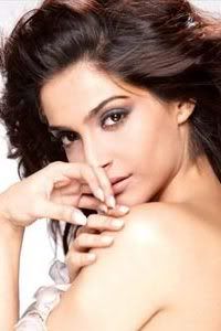
Sonam: I think your face looks a lit bit weird. I think your mouth very stiff but I can see that you trying to promote your bracelet but I think this will be worked out better if this photo is not in black and white because we want to see the accessory too here.
Brody: I actually like your facial expression but I don't know how I feel about the theme. If your theme is accessories you are obviously showcasing the bracelet, but yet I hardly notice it when I look at the photo.
Amanda: "Accessories" is plural - you only have one here. You could benefit a lot from having a matching necklace, earrings, and a hat, with your hair tucked behind one ear in a similar pose, and you'd make a stronger impression on the theme. I do like the face and pose and how you have your hair (even without a hat), but that white bar across the bottom catches my eye just as much as the bracelet does. That's a problem, and the relation to your theme is relatively minimal because of that. It is a good photo but it isn't great for your chosen theme.
Tom: Lea you are very beautiful and this is a beautiful picture. I like how you picked your theme and i like how you did what it asked.
Mandy: Lea, this photo is amazing. Your hair and facial expression are absolutely stunning, and I especially love your fingernails. That being said, I wish that you'd done a photo that had a few more accessories, since the bracelet by itself (while beautiful) isn't enough of a central focus to really justify it as a central element.
It's still delightful, though!

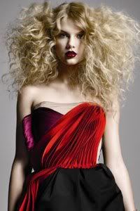
Sonam: I'm in love with this photo. Your skin is flawless. I just wish your would flip your hair at back so we can see the necklace more because I believe it's super gorgeous. Other than that, I think this is an outstanding photo
Tom: One of the best photos from you yet Taylor. Loving the look, the lipstick, the pose and most importantly i like how this photo is all about you.
Amanda: Amazing makeup. Amazing view. You really look like a model in this photo. The only issue I take is that I hardly noticed the necklace at first because of your hair - although it definitely makes a great photo, it doesn't make it about the accessory. Overall, it's great but it isn't as nice for the theme as it could be. At least it is way better than one of those flowery headbands you mentioned - "dorky" would be an understatement for that. The lipstick is great too and some people count the most visible kinds of makeup as an accessory. Not me but it works.
You keep impressing us and this is no exception. Keep it up!
Brody: Agree with the other judges. Great job! If the necklace was removed from the photo, the photo wouldn't even be worth our time, which I think makes this a great photo for the theme. The accessory really is the center of my attention when I look at the photo. I think by wearing an outfit that is a little on the plain side helped. It didn't detract form the necklace. The only thing I wasn't crazy about is what Sonam already said, with the hair covering up a lot of the necklace, but other than that great job!
Mandy: Taylor, I'mma give you the same criticism I gave Lea, in that I kind of wish that you had included more than one accessory. While the necklace is stunning (along with the rest of the picture, ohmahgash!), it's still only one accessory. But that's a minor quibble. Your hair is fantastic, your makeup is gorgeous, and it's a great photo overall.
Last but not least, Team Purple with Smizing

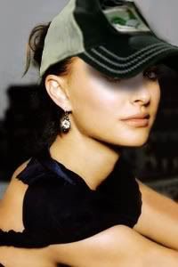
Sonam: I think this is your best shoot so far, Nat.. You look fierce and I can see your smizing. I love the styling and good job Nat
Brody: VERY good job! The photo is simple but elegant. There aren't any awkward moments that I cringe at and it has a good aesthetic value.
Amanda: VERY sexy. Great theme and great use of it - this, along with last week's, is easily one of the best photos we've seen from you so far. Keep it up, and have fun at that retreat!
Tom: I will agree with everyone when they say best shoot yet. You are very hot and beautiful in this photo.
Natalie, this photograph is magical. I think you nailed the theme perfectly, your facial expression is beautiful, and every element of this photo is stunning. Amazing job!

Sonam: Very sexy and fierce. I love your mouth. I think you're smizing in this photo and I really like the styling. I love the fact that you use the photo from the same photoshoot with your avatar because there's a reason why I picked that avatar for you.
Brody: Much better than last week! I think you chose a good theme and executed it well. The photo looks beautiful and is pleasant to look at. I'm glad to see the improvement from last week.
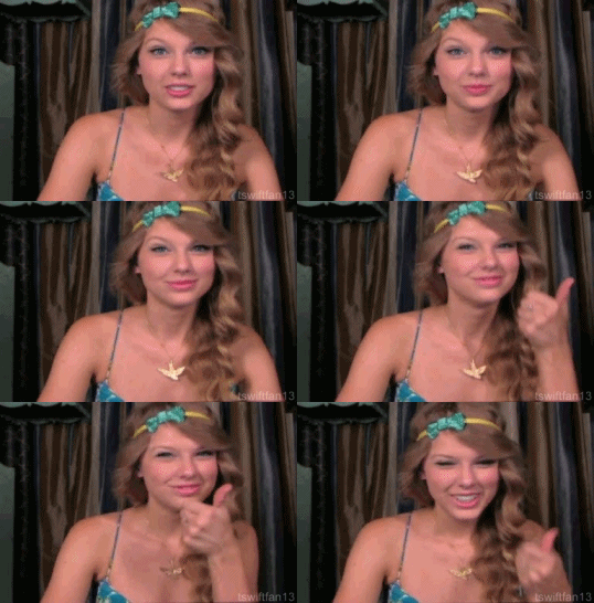
Amanda: I wish we could see a little more of your body here, as someone pretty much HAS to focus on one of two things: your eyes or your headband, which makes the "smizing" part VERY visible. This is both a good and bad thing - good in that it applies to the theme, bad in that it has to. I'm also not completely sold on that headband since it sort of distracts from the smize but it's a huge improvement from last week. Expect to be safe this time. ^_^
Tom: I'm not sure what Smizing is but i like this photo a lot. Very pretty. the one thing i dont like is your hair its too crazy
Sonam: Lol Tom, Smizing is Smile with the Eyes
Mandy: Olivia, I think this is a beautiful photo, and your hair and accessories are unbelievably gorgeous. That being said, I'm not sure that I really get the "smizing" element of this photo. Your eyes seem to be conveying more fierceness than a smile to me, if that makes any sense. It's still a totally stunning photo, though.
Welcome to your Fifth Judging Session. This week you need to submit a theme for your photoshoot with your assigned teammates.
Let's see how you guys did it this week
First Up, Team Blue with Love Comparison

Sonam: I think your theme is really creative and I love this photo. Your legs are so beautiful and I can see the relationship that you want to portray.
Brody: The theme is definitely very creative. I'm not that big of a fan of the photo though. It looks almost cheaply done. Something I would find it a JC Penny ad. Its alright, but nothing that great.
Amanda: I love the theme, but this photo is... missing something. It fits your theme perfectly in a way, but I really don't see any... "relations" between you and the man. He DOES seem cliche in several ways, but this looks like two independent stories converging upon the same scene in a way that neither takes notice of. Each is still doing their own thing - their paths don't completely cross.
That's the main issue I have with it, given the understanding I have of the theme. It's a great photo and it works, but it isn't as... relating as I'd expect it to be. Good points for the theme though!
Tom: I'll have to agree with Brody. Looks kind of cheap and the guy is sort of awkward, looks like your in a play girl house. I love the pose though.
Amber: Well the photo is showing how shallow we are. Also how we don't really care about our relationship like Ziyis picture does. And how dare you call me a jc penny model!!! plz I am a vogue model
Amanda: Doesn't that completely contradict your theme? Isn't the theme supposed to have one person show real feelings and the other one to just go along with it? From what it sounds like, you're arguing here that you're BOTH the "fake, phony, all for the cameras totally Hollywood cliche relationship" person. Am I correct?
Amber: No we are doing a comparison of love. So like Ziyi got the real type that "normal non famous type of love" while I have the fake, shallow all for cameras type love. When I say we dont care about our relationship I mean its just all for cameras. Were putting on a show. While in Ziyis picture its all real. I guess it should be called relationship comparisons instead then
Mandy: The English Major in me needs to step in and say that if you're showing two different kinds of relationships and highlighting their differences, you're actually doing a relationship contrast, not a comparison.
Aaaanyhoo, let's have a look-see here.
I absolutely love your pose in this, and the accessories are simply stunning. You definitely convey a sense of shallowness and fakery very well, and I do get the sense that whatever relationship exists between you and Mr. Tanning there is an estranged one, so well done!
The only thing I'm not a fan of here is how small the photo is. It's a bit hard to really see your face and hair in this shot, which is a disappointment, but overall you did well!

Sonam: The logo kinda distracted me but I hope it's not an issue for the other judges because I can feel the love between you and your partner. I love that you guys were flirting around and your styling is very simple but beautiful enough
Brody: Again, I don't understand why people leave these easy to remove logos in. Clone stamp could have removed that easily. But regardless, the photo isn't that great. Sorry. I was a fan last week when everyone else wasn't, but this photo just isn't doing anything for me. Definitely not the worst of the week, but no where near the best.
Amanda: Yeah, that logo would have been easy to paint out, even in MSPaint... it sort of distracts me from you or him.
You seen to be having a lot more fun than he does and it does go with the theme, but... like Brody, it's not doing as much for me as it could. I love your smile, your hair, and your dress, but there's something that irks me about it. Sure, he's being flirted with and smiling because of it, but the setting seems staged and it doesn't seem... natural. That might be what my issue is with it, but I'm not completely sure. It's not bad and I like it more than last week's but don't expect first call out. Sorry.
Brody: I think Amanda got it. I kept trying to put into words why I didn't like it. It seems staged, which it obviously is. If it had looked more natural and intimate, I think the shot would have been much more successful.
Tom: This is by far one of my favorite photos of you. I dont think it's bad at all. I love the playfulness in the photo. Like Amanda said prob not first call out worthy but i really like it
Mandy: I'm also going to agree about the logo thing. ATTENTION ALL MODELS: I am going to take this opportunity to say this to all of you! I hate words and things in your photos. They make me cry.
Sorry about that. Where was I?
I actually quite like this, and the psuedo-staged element of it is actually kind of endearing to me. It's actually kind of sad how much this looks like an Asian version of me and my significant other. True love has awkward moments like this, where people are so comfortable with one another that to the rest of the world it looks weird.
I'm not a huge fan of the face in this photo. The grin just seems to make you look old, for some reason, and your youthful glow has always been one of your strongest selling points. That being said, I absolutely adore your dress, and the pose is flirty and fun and casual, but at the same time it's not so relaxed that it ceases to be a modelling shot. I also kind of love how your toenails match your dress. It's the little things like that that make magic happen.
Next up is Team Red with Couture

Sonam: I love the dress. I can see the vintage element in that couture and I love vintage. I think the pose is good. The styling too but I wish you would wear a shoe because it's a little bit awkward to see your bare feet
Brody: I Love this photo! I think your pose is perfect along with the lighting. It really captures your beauty. Great job!
Amanda: I don't really take notice of the bare feet since the dress is so front and center. I love the pose and everything goes well together. The theme isn't the most creative, but you make good use of it and are quite striking. Overall, it's good, but not great.
Tom: Yeah, your foot is awkward but i like the vintage of it. It's like a portrait of you 100 years ago. I like your hair and your outfit but i'm not a fan of your face, it kind of creeps me out.
Mandy: Camillla, I absolutely love the intensity of your facial expression here! You've got a very rich vintage look going on, and with a ruffly dress like that, you'd be expecting something very demure, but you've got this amazing fierceness going on, which really takes the couture to a whole new level. The lighting and your makeup really add to the effect. It's quite stunning.

Sonam: I don't like the setting especially the background. This would look good with a white background. But other than the cheap background, I think you look wonderful. I love the styling and the pose. Very strong face expression and this is high fashion for me
Brody: I don't really like this photo. The dress looks awkward on you, hiding your beauty. And I have to agree with Sonam on the background, it makes the whole photo look cheap.
Amanda: I'll third the background - it robs the photo of the theme, or a potential story. I don't like the hair because it's a bit too retro meets... alien? (I don't even like mine like that). It also looks like you haven't completely put on your dress, and I don't like that. I do however like your facial expression and the pose (and I do like the dress too, it just looks like the sleeve is in front of you and that's bad in my opinion). But overall... I'm mixed about it.
Tom: I actually like this a lot. Very model like and very well done. The dress looks like someone wrapped you up and i wouldnt mind getting you under my christmas tree

Mandy: Well, too bad you're on the naughty list, Tom.

I'm a bit ambivalent on this photo. I think that it's definitely couture, and on that aspect alone you've totally nailed your theme. Personally, I don't give a toss about the background. Sure, it's a one-color background, but we've had first callouts with pure white backgrounds before. What does get me is the size. With a small picture size, it's a lot harder to take in the finer points, and can cause us judges to miss things. That being said, your hair and makeup are epicly couture, and your outfit is perfectly suited for your theme. The pose is a bit awkward, and your skin seems eerily white, to the point where I'm subconsciously reaching for my neck in case you decide to suck my blood through your fangs. All in all, a great effort.
Team Pink next, with Accessories

Sonam: I think your face looks a lit bit weird. I think your mouth very stiff but I can see that you trying to promote your bracelet but I think this will be worked out better if this photo is not in black and white because we want to see the accessory too here.
Brody: I actually like your facial expression but I don't know how I feel about the theme. If your theme is accessories you are obviously showcasing the bracelet, but yet I hardly notice it when I look at the photo.
Amanda: "Accessories" is plural - you only have one here. You could benefit a lot from having a matching necklace, earrings, and a hat, with your hair tucked behind one ear in a similar pose, and you'd make a stronger impression on the theme. I do like the face and pose and how you have your hair (even without a hat), but that white bar across the bottom catches my eye just as much as the bracelet does. That's a problem, and the relation to your theme is relatively minimal because of that. It is a good photo but it isn't great for your chosen theme.
Tom: Lea you are very beautiful and this is a beautiful picture. I like how you picked your theme and i like how you did what it asked.
Mandy: Lea, this photo is amazing. Your hair and facial expression are absolutely stunning, and I especially love your fingernails. That being said, I wish that you'd done a photo that had a few more accessories, since the bracelet by itself (while beautiful) isn't enough of a central focus to really justify it as a central element.
It's still delightful, though!

Sonam: I'm in love with this photo. Your skin is flawless. I just wish your would flip your hair at back so we can see the necklace more because I believe it's super gorgeous. Other than that, I think this is an outstanding photo
Tom: One of the best photos from you yet Taylor. Loving the look, the lipstick, the pose and most importantly i like how this photo is all about you.
Amanda: Amazing makeup. Amazing view. You really look like a model in this photo. The only issue I take is that I hardly noticed the necklace at first because of your hair - although it definitely makes a great photo, it doesn't make it about the accessory. Overall, it's great but it isn't as nice for the theme as it could be. At least it is way better than one of those flowery headbands you mentioned - "dorky" would be an understatement for that. The lipstick is great too and some people count the most visible kinds of makeup as an accessory. Not me but it works.
You keep impressing us and this is no exception. Keep it up!
Brody: Agree with the other judges. Great job! If the necklace was removed from the photo, the photo wouldn't even be worth our time, which I think makes this a great photo for the theme. The accessory really is the center of my attention when I look at the photo. I think by wearing an outfit that is a little on the plain side helped. It didn't detract form the necklace. The only thing I wasn't crazy about is what Sonam already said, with the hair covering up a lot of the necklace, but other than that great job!
Mandy: Taylor, I'mma give you the same criticism I gave Lea, in that I kind of wish that you had included more than one accessory. While the necklace is stunning (along with the rest of the picture, ohmahgash!), it's still only one accessory. But that's a minor quibble. Your hair is fantastic, your makeup is gorgeous, and it's a great photo overall.
Last but not least, Team Purple with Smizing

Sonam: I think this is your best shoot so far, Nat.. You look fierce and I can see your smizing. I love the styling and good job Nat
Brody: VERY good job! The photo is simple but elegant. There aren't any awkward moments that I cringe at and it has a good aesthetic value.
Amanda: VERY sexy. Great theme and great use of it - this, along with last week's, is easily one of the best photos we've seen from you so far. Keep it up, and have fun at that retreat!
Tom: I will agree with everyone when they say best shoot yet. You are very hot and beautiful in this photo.
Natalie, this photograph is magical. I think you nailed the theme perfectly, your facial expression is beautiful, and every element of this photo is stunning. Amazing job!

Sonam: Very sexy and fierce. I love your mouth. I think you're smizing in this photo and I really like the styling. I love the fact that you use the photo from the same photoshoot with your avatar because there's a reason why I picked that avatar for you.
Brody: Much better than last week! I think you chose a good theme and executed it well. The photo looks beautiful and is pleasant to look at. I'm glad to see the improvement from last week.
Amanda: I wish we could see a little more of your body here, as someone pretty much HAS to focus on one of two things: your eyes or your headband, which makes the "smizing" part VERY visible. This is both a good and bad thing - good in that it applies to the theme, bad in that it has to. I'm also not completely sold on that headband since it sort of distracts from the smize but it's a huge improvement from last week. Expect to be safe this time. ^_^
Tom: I'm not sure what Smizing is but i like this photo a lot. Very pretty. the one thing i dont like is your hair its too crazy
Sonam: Lol Tom, Smizing is Smile with the Eyes
Mandy: Olivia, I think this is a beautiful photo, and your hair and accessories are unbelievably gorgeous. That being said, I'm not sure that I really get the "smizing" element of this photo. Your eyes seem to be conveying more fierceness than a smile to me, if that makes any sense. It's still a totally stunning photo, though.

